Playing with Data

Personal Views Expressed in Data

Population Density Background Maps for GRx Radar Viewers

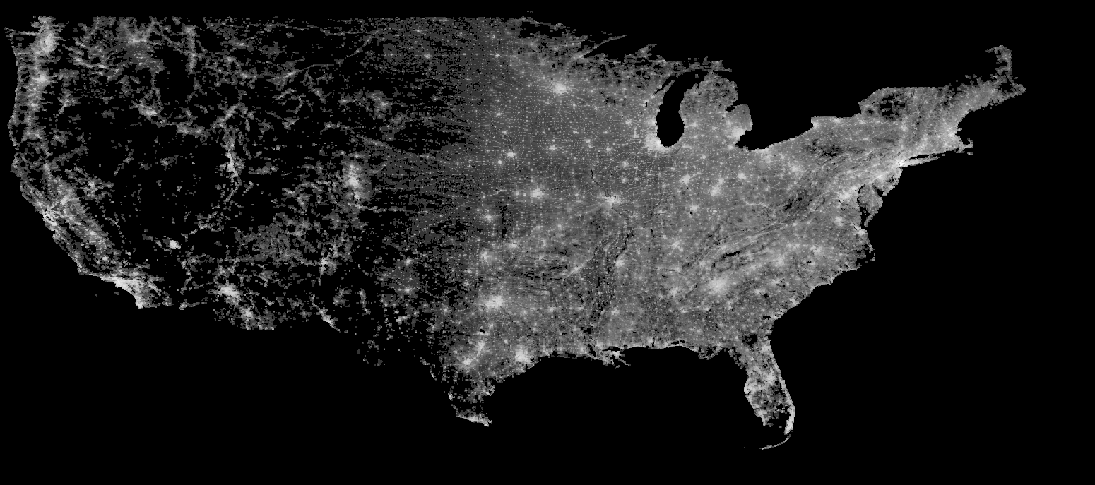
Tonight I created a couple of Gibson Ridge Radar Viewer backgrounds that display the 2010 population data on a 5km grid. You can see a color and black and white version below. Since the background images are actually displaying interesting data, I’ve also provided a colorbar for both of these images. The color curve is logarithmic.

and

You can see what they look like in GR by looking at this and this. If you would like to download these background images, you can get the color version here and the black and white version here.

To install, you will need to:

  1. Start GR
  2. Click on “GIS” in the menu across the top
  3. Click on “Setting” in the resulting drop-down menu
  4. Click on “Backgrounds…” in the resulting drop-down menu
  5. Select the file you downloaded. (You will need to unzip the zip file if you haven’t already.)
  6. Enter the longitude and latitude values for the various corners. These are:
    • Left Lon: -125.
    • Right Lon: -63.
    • Bottom Lat: 22.5
    • Top Lat: 50.
  7. Select “OK”

If you like these, please let me know!

Climatological Estimates and Evolution of Local Daily Severe Weather Probabilities: Part 3

For the final post (at least for now) in this sequence of estimating the climatological probability of an occurrence of some sort of severe weather phenomena, I turn my attention to day 1 severe weather outlooks from the Storm Prediction Center.

I used a similar method as with the previous graphics, however, because the severe weather outlooks are larger in size than severe weather reports, I used a smaller spatial smoother. (In fact, you can do the analysis without using a spatial smoother, but the probability edges are jagged.) The spatial smoother is 80km, and affects the resulting probability magnitudes by less than 1% for slight risks.

For more animations, check out the original post, the “non-significant” severe first post in this series, or the "significant severe" second post! As with the previous graphics, the raw images should become available on the Storm Prediction Center’s website in the coming weeks.

Because the image quality is a bit degraded in the animations, the color scales for each animation are listed below.

Slight Risk (or greater): 5%, 10%, 15%, 20%, 25%, 30%, 35%, 40+%
Moderate Risk (or greater): 1.00%, 2.00%, 3.00%, 4.00%, 5.00%, 6.00%, 7.00%, 8.00+%
High Risk: 0.05%, 0.1%, 0.25%, 0.40%, 0.55%, 0.70%, 0.85%, 1.00+%

Climatological Estimates and Evolution of Local Daily Severe Weather Probabilities: Part 2

I’ve now uploaded the animations of estimates climatological probabilities of F/EF-1 or greater tornadoes, Hail 1″ or greater, and significant severe weather. The probabilities are estimated from the 30 year period of 1982-2011. Probability animations exist for tornadoes, hail, wind, and any severe. For more information check out the original post or the post on the “non-significant” severe! The raw images should become available on the Storm Prediction Center’s website in the coming weeks.

Because the image quality is a bit degraded in the animations, the color scales for each animation are listed below.

Any Significant Severe: 0.10%, 0.25%, 0.50%, 0.75%, 1.00%, 1.25%, 1.50%, 1.75+%
F/EF-1+ Tornado: 0.02%, 0.10%, 0.20%, 0.30%, 0.40%, 0.50%, 0.60%, 0.70+%
Significant (F/EF-2+) Tornado: 0.01%, 0.05%, 0.10%, 0.15%, 0.20%, 0.25%, 0.30%, 0.35+%
Significant (64kt+) Wind: 0.05%, 0.10%, 0.20%, 0.30%, 0.40%, 0.50%, 0.60%, 0.70+%
1″+ Hail: 0.10%, 0.50%, 0.75%, 1.00%, 2.00%, 3.00%, 4.00%, 5.00+%
Significant (2″+) Hail: 0.05%, 0.10%, 0.20%, 0.40%, 0.60%, 0.80%, 1.00%, 1.20+%

Climatological Estimates and Evolution of Local Daily Severe Weather Probabilities: Part 1

I’ve cleaned up and finally uploaded the animations of estimates climatological probabilities of severe weather. The probabilities are estimated from the 30 year period of 1982-2011. Probability animations exist for tornadoes, hail, wind, and any severe. For more information check out the original post! The raw images should become available on the Storm Prediction Center’s website in the coming weeks.

Because the image quality is a bit degraded in the animations, the color scales for each animation are listed below.

Any Severe: 0.25%, 1.00%, 2.00%, 3.00%, 4.00%, 5.00%, 6.00%, 7.00%, 8.00+%
Tornado: 0.10%, 0.20%, 0.40%, 0.60%, 0.80%, 1.00%, 1.20%, 1.40+%
Wind: 0.25%, 1.00%, 2.00%, 3.00%, 4.00%, 5.00%, 6.00%, 7.00+%
Hail: 0.25%, 1.00%, 2.00%, 3.00%, 4.00%, 5.00%, 6.00%, 7.00+%

Playing With Data

The past few months I’ve called my blog “Fighting Hyperbole with Data”. This was a nod toward the reputation I cultivated of “poking the bear with a stick”. Admittedly, that reputation was a bit of hyperbole in and of itself, an irony that was not lost on me. I went ahead and left the title as it was because I liked the idea of being someone who remained above the hype and focused solely on the data. I didn’t always adhere to these principles, but when I veered off track, or made a mistake, I always tried to be open, honest, and admit/correct the mistake. That’s the way blogs work; they are built on trust between the author and the reader. Readers implicitly trust authors that what they are reading is factual; authors trust that readers will appreciate their work, share the information with friends when something is of interest, and refrain from passing off the work as someone else’s.

To this end, I’ve decided to rename the blog to simply “Playing with Data“. It’s a better description of what I do and, more importantly, what I want this blog to be. I like data. I play with data. I enjoy data. Data are everywhere and offer insights into a world of chaos. All it takes is time to learn the tools necessary to peel back the layers of obfuscation. Our world is full of information just waiting to be discovered or put into context. This is my underlying motivation for becoming a scientist. A fundamental curiosity of what I don’t know or don’t understand.

Readers may have noticed that some of my more recent work (figures) have my name and a link to the website embedded in them. This is in response to a alarming increase in the number of instances of seeing my work used without permission and without attribution. I’ve wrestled with this a lot of late. I don’t mind people sharing my work as long as I get credit for the work I put into it. sharing interesting and sometimes exciting discoveries with all who care to learn and protecting my work. I try to be protective of my work because I put a lot of effort into it. I typically work 60-80 hours a week on “science”. To date, nothing to my knowledge posted on this blog is what I’m paid to do as a graduate research assistance. This means none of this work helps me get closer to graduating and that all of it is done “on the side”. Yes, I do love it, but at the same time I am working to develop my skill set in hopes maximizing my chances of future employment. I’m still a student. A student who is graduating in the next 6 months. A student who is on the job market. I post things to this blog in an effort to share information, but also to highlight my work in hopes of attracting interest from those in positions to offer me jobs (consulting or full-time). I naively thought that “branding” my work wasn’t necessary, and even presumptuous. Apparently, I’m not very good at marketing.

Admittedly, this has impacted my posting frequency of late. I’m much more hesitant to post things here that may be of benefit to me down the road. As a strong advocate of the open-source model this hesitance to share work results in an internal struggle to balance sharing and protecting. I don’t suspect this struggle won’t go away any time soon, but I want to reaffirm my commitment to keeping the trust of those who read this blog. I know I don’t always perfectly adhere to my ideals; I’m learning to respond professionally when others don’t. I’ve got a ways to go, but hopefully you’ll stick around as I continue to grow as a scientist. I’m sure we’ll learn some really cool things along the way.